 Not to be confused with Kat the Rouge, who I suppose would be a makeup artist. | Kat, Human Rogue
Kat the Rogue is the third in my series of Castle Ravenloft heroes. The first two, Allisa and Thorgrim, are regulars in our games because of their respective auto-hit and healing powers, but Kat is becoming our bench star. Her special power is one sorely needed, which is to disable traps. Traps are encounter cards that put a permanent threat on a tile, which can be deactivated with a successful roll. My experience with traps is that I usually just die whenever they show up, but Kat changes the odds from 50-50 to 75% of deactivating a trap. She also has a good ranged attack and some utility powers that come in handy. Larger groups will find her more useful than will a party of 1-2, so we tend to play Kat as our third character. |
| Again, I started with some research to decide what Kat would look like. First, her facial features suggest she is Asian, so black hair and a darker-yellow flesh tone would be appropriate. Second, although she is described as a "rogue," her appearance suggests a "thief" or "ninja." Her card color is grey, so I plan to use a black/white/grey palette for her with a grey base, in keeping with my previous pattern of using color schemes and bases matching the character card color. I'm also thinking Lucy Lawless here - no particular reason, I just enjoy thinking of her. Actually, there is some decent similarity between Kat and Xena, Warrior Princess; although, as a rogue, Kat is wearing less metal and more quiet fabrics. I have two researched images below, a black Kat and a blue Kat. I initially thought that a pale blue would look nice, and could be close enough to grey to fit into the color palette I determined before. As a generic playing piece, I think the blue looks nice and adds a pleasant splash of color. However, I think the character's theme is reinforced by monochrome garb and helps to set her apart from a generic fighter.
|   D&D stands for "Death and Destruction," right? |


In the image below on the left, I started my work on Kat by painting her face and hands a light brown (I think it was a mix of flesh and brown) - just a reminder, the grey is the primer I spray on plastic to help my paint stick. S1 had mixed a pleasant silvery blue, which i decided to use on her cloak. As mentioned above, I eventually decided to forgo the blue and painted over it with grey. In the middle image, all of Kat's clothes were painted black as a base coat and I painted over her face in dark flesh. In the image on the right, I have spent the whole day working on just her cloak. Paint the creases black, layer on the gray, re-emphasize the black, paint over in gray, ad nauseum. I tried to make a glossy black for the hair, but the metallic sheen came out as grey. The contrast is not as stark but I suppose it is acceptable. Maybe she is a middle-aged ninja?
After reviewing the images I used for research, I realized that the elbow of her upraised arm can be interpreted as nude. I think this change, and reinterpreting her right "glove" as her bare hand looks much better. One of my big regrets of Alissa was my realization that I had completely covered her in armor; the figures look so much better when there are organic breaks in the clothing. Despite my best efforts at remembering, I did forget to add shadowing to the crook of the elbow.
 Blue cloak? Not my style... |  Kickin' it like a ninja |  I spent the whole day just on this cloak |
 Here's looking at you, babe
 This is my closeup of Kat's final face. I gave her white eyes with purple "pupils"; as with the Archmage of the Underdeep, I used a stickpin to put a fine dot of color in the center. Doing the whites of the eyes is a lot easier than I thought - the white splashes around a bit, but it's easy to clean up the edges by repainting the face. Of course, if the skin tone is a mix, then redoing it multiple times is a pain. The lips are pink darkened with some red - IRL this looks messier than in this picture, because I tried to paint it on. Next time, I'll stick with the stickpin.
The hairline is too low; see the above left image where only Kat's flesh is painted to see where the hair should be. Thick paint or paint retouches can obscure fine detail, which i am working to be more careful of. She might look better with eyebrows, too. Note also how you can see detail on her hand; the darker brown beneath the flesh color provides shadowing between fingers and on the palm by the fingertips.
See below for more pictures: for her armor, I used brown for leather straps, ties, and boots. The kneepads are steel, as are the knives strapped to her legs (and her sword and throwing knife). I brushed some steel onto her armbands to make them shiny. Her chestpiece is an additional layer of armor, which I painted a lighter grey for contrast (and painted the undershirt a deeper black. I could have gone the trashy route and painted flesh underneath instead of black, so that the chest armor would be a bustier. All for the best, I suppose, that it is as it is. I did the base in grey to match the card, but I think a saturated color would have been better - maybe even a deep black. I can't decide whether her details would show better against grey or black, but I did it this way so there.
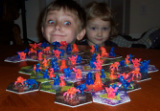
Who knows what evil lurks in the hearts of men? Kat the Rogue knows!
The hairline is too low; see the above left image where only Kat's flesh is painted to see where the hair should be. Thick paint or paint retouches can obscure fine detail, which i am working to be more careful of. She might look better with eyebrows, too. Note also how you can see detail on her hand; the darker brown beneath the flesh color provides shadowing between fingers and on the palm by the fingertips.
See below for more pictures: for her armor, I used brown for leather straps, ties, and boots. The kneepads are steel, as are the knives strapped to her legs (and her sword and throwing knife). I brushed some steel onto her armbands to make them shiny. Her chestpiece is an additional layer of armor, which I painted a lighter grey for contrast (and painted the undershirt a deeper black. I could have gone the trashy route and painted flesh underneath instead of black, so that the chest armor would be a bustier. All for the best, I suppose, that it is as it is. I did the base in grey to match the card, but I think a saturated color would have been better - maybe even a deep black. I can't decide whether her details would show better against grey or black, but I did it this way so there.
Who knows what evil lurks in the hearts of men? Kat the Rogue knows!
 |  |  |
 RSS Feed
