My plan for painting my first figure is to start with the spider nests. They are simple designs with a simple color model (black!) and I have six to experiment with, so this should be easy. Of course, I can't do anything the easy way, so before Is tart here are some articles and tips on painting basecoats.
squash at BGG:
Step 5 - Blocks of colour
Quote:
"Now you can finally sit down at your painting station and pick up the brushes! (I recommend spreading old newspaper over the surface upon which you're working, unless you don't mind dripping paint onto your desk/table.) You'll now apply most of the figures' colour, but don't worry about the fine details yet. It's generally recommended that you take an "inside out" approach to painting the figure. For example, I will start with the skin, then do any under clothing that's showing, then paint the outer clothing, then the armour/weapons, and finally belts and accessories. This allows you to not worry about going "outside the lines" because the next layer is going to cover any sloppiness created by the previous layer, and will ensure full coverage of the figure without any white gaps showing through. Also, if you find that your paints seem too thick and you're worried they might be obscuring some detail, it doesn't hurt to thin them with a bit of water."
hot-lead.org
Painting - Basic Techniques
Quote:
"I usually begin painting from the ‘inside’ out here, i.e. flesh to cloth to armor; there’s less chance of accidentally making a mistake and getting paint on a previously-painted part that way. Picking a color scheme for the miniature also gives you an idea of what areas to paint first, too. Dark paints cover up light ones easily, not vice versa, so if you accidentally get flesh color all over another area that's supposed to be black, no problem! But paint black on an area that's supposed to be flesh and you'll have to use some white paint to re-primer over the black mistakes, before painting the flesh color section, since the flesh paint won't cover the black up."
"Your painting should start with a good foundation: the basecoat. This is the initial layer of paint that you’ll be doing all of your other work (drybrushing or blending) on top of. You want the basecoat layer to cover well, but not be so thick that it obscures fine details. A good rule of thumb is mixing the paint with water about 3 to 1; it should look sort of like heavy cream. If the first coat seems too thin (primer shows through), then paint on a second one. I can’t emphasize enough, though, that the paint shouldn’t be too thick! A few thin layers is better than one, goopy layer..."
How-to-paint-miniatures.com
Colors
The linked article provides a tutorial on color schemes - references primary, secondary, and tertiary colors. Not exactly revelatory, but you can't start a primer in media res. Complementary color combinations and harmonizing color combinations are handy for those of us without sense in combining colors. A reminder on identifying "warm" and "cool" colors is useful as well.
Quote:
"Typically you'll want to use no more than two main colors. Select one warm color and one cool color to gain contrast. You can select a third color such as black, white, or ivory, which are not primary or secondary colors with which to provide a neutral tone which makes the main colors stand out more. "
how-to-paint-miniatures.com
base coating
I think this part of the article on painting your basecoat is so helpful that I am quoting it in its entirety:
"Once you have decided on a color scheme, you can begin to paint the base coat. If you are going to do any washings later, you will want to pick a color that is slightly lighter than the color that you want to end up with. This is because the wash will tend to darken the base color before you are done...Notice how thin the first coat of paint is when applied. This prevents loss of fine detail. Within another coat or two of paint, you build up an opaque base coat, while preserving the details. One of the sure signs of a beginner miniature painter is using paint straight out of the bottle. They don't dilute it. The result? The thick paint obscures the fine details of the miniature, the very thing which separates cheap minis from great ones."
"When starting out, thin your acrylic paints with water until they have a thickness similar to milk. Don't load your brush with too much paint at a time to keep it from flowing outside of the area you're painting. Wipe off any excess paint from your brush on a paper towel or napkin. As you paint the base coat, prevent the paint from pooling in recesses of the miniature, which would fill in details. If you get too much paint on any part of the miniature, before the paint dries, clean and dry your brush. Then use it like a sponge to mop up any excess paint."
"I like to start with the deepest, hardest to get to areas first, working my way outwards to the most easily accessible areas. Some painters have described it as painting items on the miniature "in the order you would get dressed." Since shoes go on after socks, paint the socks first. This works fairly well since if you get paint on the shoes when painting the socks, this area will then get painted over anyway when you paint the shoes. "
Cygnar by misterfinn
painting-clinic (By Anthony Karl Erdelji)
Painting White
This article is on painting white, black, and red. Building up white coats is discussed, along with the difference between the perceived temperatures of different white blends. Not as well illustrated as some of the other guides, unfortunately - subtle details in coloration are exactly the sort of thing I'd like a visual guide to.
Quotes:
"For shade, you first have to decide on if you want your white to be warm or cool. Warm colors are shaded with browns and cools are shaded with gray. For warm white, create a very thin wash using flesh or chestnut ink, around a 1:8 ratio works well. You can wash the entire area with the wash, but if possible, try to use it only in the recesses where you need shade. You may want to apply additional washes to get the desired effect. Don't go overboard though. remember you want white, not brown. Finish by reapplying white to the raised areas or if its a rough surface, like feathered wings, a drybrush of white will work."
"Cool white is painted the same way, but substitute gray for the flesh wash. Take a light gray paint and thin it to about 1:8, or more, depending on the thickness of the paint. Brush it on just like a wash, repeats if necessary. Follow up by reapplying white."
"Remember that you don't highlight white like other colors. Your base color is white and your highlight color is white. I've seen lots of people who think that they have to highlight white so they basecoat with gray so they can highlight with white. If you do that, you just painted gray, not white!"

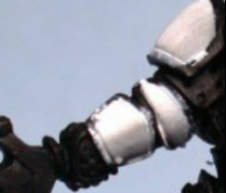
Vampire Dragon By Anthony Karl Erdelji
painting-clinic (By Anthony Karl Erdelji)
Painting Black
A continuation of the previously mentioned article. the author's comment about black having other colors is something I've noticed before; a lot of blacks are very dark greens or blues (which will bleed in interesting ways if you wash them). I like the idea of tinging my black with reds, greens, or blues.
Quotes:
"Painting black can also be difficult, but you can also get some interesting effects by highlighting it with different colors. you may of just read how you do not highlight white. Well, with black, don't shade it. You can't get darker than black. Knowing that lets start with the two basic ways to highlight black; blue or gray."
"When I want black to appear very dark, like an assassin might wear or when painting a black dragon, I use blue. Basecoat with black thinned to 1:2. The first set of highlights with a mix of dark blue with black, thinned to 1:5. This is applied sparingly to just the top highlights. Then I use a pale blue thinned to 1:2 and brush this only on edges or the tops of very tight folds."
"Sometimes I use gray to highlight black instead of blue. If you use gray you black will end up looking worn. I highlight with gray on my undead and for creating salt-and-pepper hair. After basecoating witch black I highlight with a very dark gray diluted to 1:5. Then I highlight with a very light gray on the edges and tight folds. This works very well when painting torn clothing like undead tend to wear."
"Blue and gray are mainly what you'll use for your highlights, but you can get some great effects by highlighting black with different color such as red or green. Try starting with a very dark color thinned to about 1:10 and slowly build up the highlights. Don't go overboard, though. Remember that you still want black, just with a hint of color added to it."

Assorted white objects for reference, brushthralls.com
brushthralls.com (Posted by misterfinn)
Painting White
Nicely illustrated discussion of the color white and how we perceive it. A few easily-identifiable white objects are shown and he compares and contrast the ways in which we perceive each to be white. Following is a step-by-step demonstration of painting white and how to give it life and the appearance of texture. The author recommends using a bright light to cast shadows on the figure's features, showing where to darken and lighten.
Quotes
"... photographs of white objects against a white background illustrate a key concept in painting white. White objects are primarily defined by their shadows. When you look at these objects, they have no color of their own to separate them from their backgrounds. The only way to tell that the object is there is by interpreting the shadows it casts... The light source dictates shadow; shadow dictates your perception of the object."
"I’m using two colors for all the shading in this example. One color is white. The other is Vallejo Model Color #907, Pale Greyblue. This is a marvelous blue-grey color that looks very natural when used to shade white. It yields a “cold” white, like the white in our examples above. For a “warm” white, use a brown-grey instead of blue-grey as your shading color. My favorite shading color for warm whites is Adikolor Battle Dust."
"The best way to ruin a blend is by overworking it while it dries. If you continue to work over the paint as it thickens, your brush will drag furrows through the paint and ruin your smooth finish. Sometimes you’ll even pull away layers of paint with the brush. This leaves glaringly obvious holes that are difficult to fill. Even though my blend at this point isn’t perfect, I leave it alone and move on to the next one."
"All that’s left to do now is carefully blackline the edges. This cleans up the slop and makes the model look clean & crisp."

brushthralls.com (Posted by misterfinn)
Painting Black
Nicely illustrated discussion of the color black and how we perceive it. A few easily-identifiable black objects are shown and he compares and contrast the ways in which we perceive each to be black. Following is a step-by-step demonstration of painting black and how to give it life and the appearance of texture.
Quotes:
"As with white, we can learn a lot about black by looking at common objects..."
"Since these objects are black, their “midtone” and “shadow” colors are identical. All the grey and white areas we’re seeing in these pictures are highlights. Here, then, is our fundamental principle in painting black. Just as white objects are defined by shadow, black objects are defined primarily by their reflectivity."
"Once we understand how we perceive black objects, painting them becomes much simpler. As with white, we’ll be amplifying the visual effect of natural light. The hardest thing about it is telling what’s paint and what’s natural reflected light while working on the model!"
"Greys in real life are almost never truly neutral, because most blacks aren’t completely black. Some are very dark brown. Some are very dark green. Some are very dark blue. Because of this phenomenon, I mix most of my own greys for compositional or textural effect. On worn black leather, for instance, I might use a beige color to lighten my black."


 RSS Feed
