
... and you smell like one too!
Happy 6 month birthday, D3!
Happy 6 month birthday, D3!
|
... and you smell like one too!
Happy 6 month birthday, D3!
0 Comments
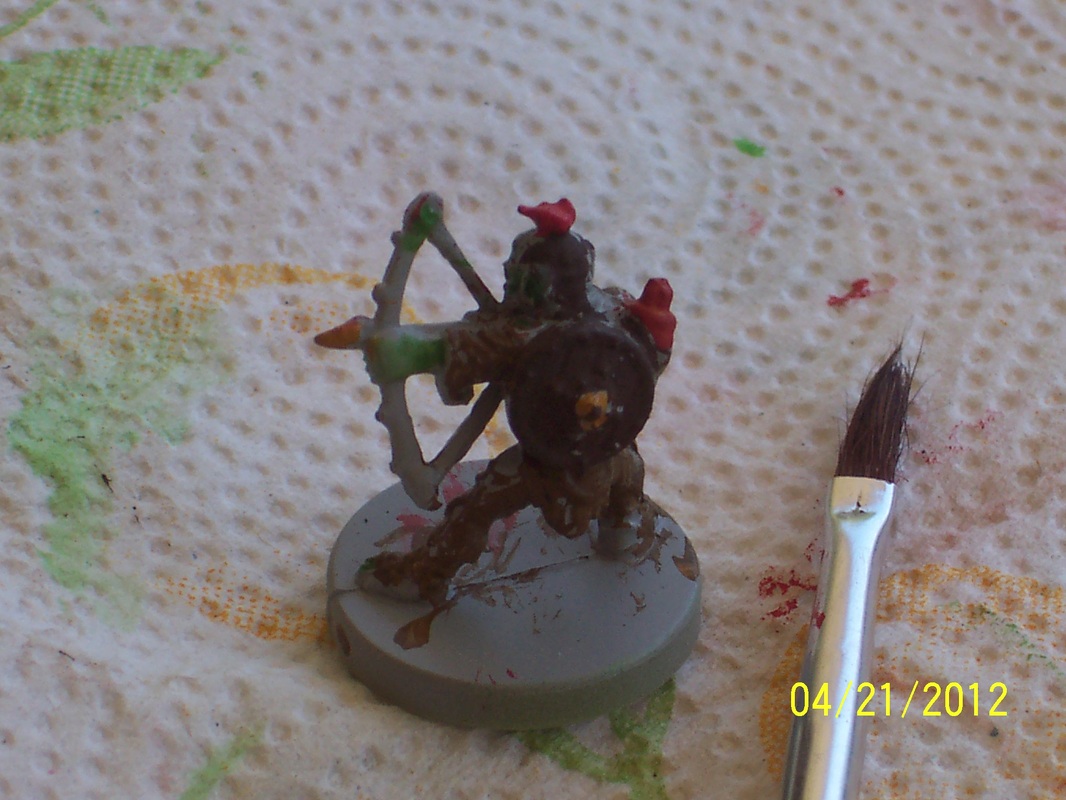
Saturday was bright and warm, which was nice for a change. Since Rob is still working weekends (so no Magic playing), I had time to do some painting. I taped old newspaper ads to the patio table and then taped some paper towels to the ads; the paper towels acted as a palette and placemat, and also allowed some contrast between the grey newsprint and grey primed figures. I had two raptors, two goblin archers, and a goblin soldier primed for today. S1 wanted to help paint and D1 showed up halfway in to paint as well, so some figures I had plans for were sacrificed for family peace. I kept one raptor and the goblin soldier, S1 got one raptor and one goblin archer, and D1 got one goblin archer. I tried giving D1 the soldier since I preferred the archer, but she wanted the archer since S1 had an archer - sibling symmetry had to prevail.
Above are some shots of S1 engaging in the artistic process. First, note that brush is not one of mine - it is the one that came with his airplane model. It's a cheap brush, but the size fits his hand well and he's not ruining one of mine (he smooshed it at the bottom of the rinse water to clean it every time). Second, you can see some flash on the base of the goblin archer. Hobby sites have recommended getting a file for removing flash, but my initial impression of my figures was that there was none. I'm sort of surprised to see it in these pictures. I wanted to block in colors for this set of miniatures, and decided to go with green for goblin skin and raptors in order to use color efficiently. I first mixed up some green wash using the Loew-Cornelle acrylic and a bit too much water. I still forget just how little paint is really needed for these size figure. I did get a bulb dropper to add water in smaller amounts, but I still overdid it. The green wash was too thin and had trouble coating the primer adequately, while pooling up in the details. I think S1 dipped his brush before I diluted the green, so he got a thicker, darker coat. I blocked in the entire raptor with green, along with the hands, feet, and head of the goblin. I found that as my wash dried I could move it around and improve the coating. Predictably though the pigment settled out in rings on the flat base. That's okay - I can add another coat later, but it does highlight the consequences of using too thin of a wash (also related to using cheap paints, but really my fault for dilution). S1 and I agreed that we wanted brown for goblin armors, but couldn't agree on the color that would look best. I put a drop of Vallejo brown (chocolate?) into one paint well. My son didn't like it, and wanted the "orange" from my Loew-Cornelle set. I thought it looked hideous in the tube - sort of a creamy-orange-brown that would be impossible to describe further without reference to bodily excretions. It looked surprisingly good on the palette though, sort of a fantasy-leather color. I still thought it was too light, so I combined the two in a third palette well and went to work on my goblin. The pants and shirt were painted with the mixed brown while the bandolier and kilt were painted with the orange. After the first coat dried, I decided that the contrast between the two browns was too weak and repainted the shirt and paints with the Vallejo brown. When it dried, the color was darker than I expected, so maybe I should have left it alone. I'm not happy with the dirt-like base, so I'll have to think about improving it.
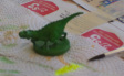 Drybrushing I'm really proud of how the drybrushing on the raptor turned out. I got the idea when S1 asked to use the Vallejo fluorescent yellow (which I bought based solely on his request) for his raptor. Again, I thought "Yuck! That will look terrible." As it turned out, though, fluorescent yellow has some green tint to it and blended well with the green on his raptor. I decided to try dry-brushing the scales with it, and it worked beautifully. The pictures I took of the in-between step did not turn out, but the visual effect was to make the scales appear to be gleaming green instead of dark green. I was amazed at how it brought out the texture (which is the point of course). To dry-brush, I added a tiny amount of paint to my brush, and then wiped it on my paper towel. Then I rubbed my brush on the paper towel and whisked it across the figure without applying pressure. The effect is to leave a little paint pigment, but almost no liquid, on the raised surfaces. Once I had a feel for it, I could whisk as if the brush were a feather-duster. This is hard on your brush, and the lack of liquid causes it to splay out; I would not use a first-tier brush for this purpose. I wanted the back to look pebbled, blending into orange and then red, with a red face. The orange blended okay, but I was hasty with the red and obscured most of the orange. I could redo the coloration, but I may just buy another and try again. I need to practice with patience. S1 liked how my raptor turned out, so he asked me to drybrush some red onto his for blood marks. Then he added some stripes of orange on his raptor's flanks and more red around the snout. I think his looks pretty cool as something that developed organically. His goblin archer has decent detail considering his attention span, but I know that D1 added some touches to it and I'm not sure which parts are whose ideas. D1's figure is blood red all over, with some brown for shoes and shield. She said he was a very violent guy.
Final thoughts:
Have not had much chance to paint lately. However, S1 painted this airplane from a kit he got in Sunday School on Easter. Good work, son! 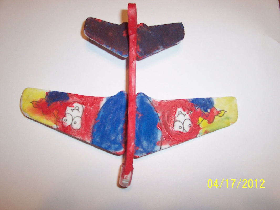
It's hard to believe that I haven't written anything for two weeks. I haven't done any painting - the weather has been lousy (cold and rainy), work has been kicking my rear, and the last crumb of available time has gone to studying for my ABR examination in May. However, the weather should be warm and sunny this weekend, so maybe I will get a chance to relax outdoors.
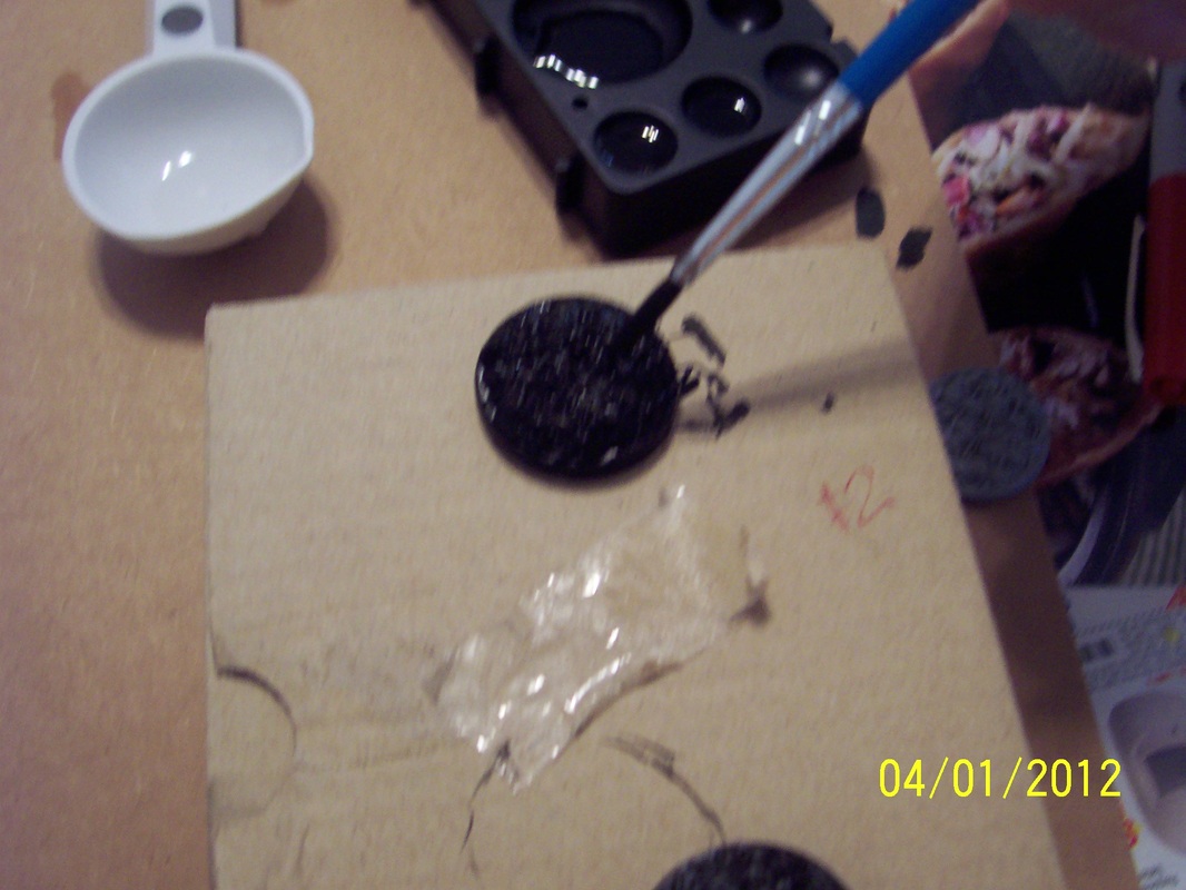
The cold and nasty weather this weekend brightened up into a warm, sunny day. Painting time! I thought. However, California has these things called "Santa Ana winds," the experience of which is roughly similar to sticking your head in a jet engine during take-off. I think that in Minnesota we called these "two-brick days" (when you need one for each pocket). It was not a good day for painting anything outdoors that is less solid than Michelangelo's David. The interior of our house lacks the ambience of the California countryside but the atmosphere is more stable. I covered the school table with cheap ads and a pizza box, then went to work. Since I had four figures from the same mold, I decided to run some experiments (as described below). Initial observations: -My cheap brush formed a nice tip when wetted; previously it looked as bushy as a dimestore paint-by-numbers tool, but in use it had the sort of tip that French artists twirling their mustaches only dream off. Definitely better than expected. -The palette was very nice - paint beaded up, did not stick to the sides, and paint wells were appropriately sized. Maybe it's heritage includes a Teflon pan somewhere? -I am still amazed at how little paint was really needed for the first coat. I squeezed a couple of mL out of my first tube, and it was far too much. A single drop from my droppers was more than adequate. There's some efficiency to be had by painting multiples simultaneously, otherwise how could you possibly use a single drop of paint? -I really need to buy an eyedropper for adding small amounts of water; trust me that tablespoons are not appropriate for the task.
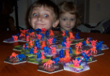
 Figure #1, cheaper acrylic black Figure #1 - for my paint, I used the cheap black acrylic and added water from a tablespoon. Too much slopped in - whoops! So this paint may have been too thin - I'll find out when it dries. I dipped my brush once and painted the figure's surface: no brush refill was needed! After coating the surface I continued to move the watery paint around, which seemed to fill in the crevices in the figure. Maybe this is how a wash works? I ended up with a light coating on top, thicker coat in crevices, which appeared as highlights and shadows. Figure detail still looked better than the raw plastic but not as well defined as with the primer coat. I suppose the black obscures shadows. Decided to add less water next time.  Figure #2, pricey acrylic black Figure #2 - I wanted to compare the performance of the expensive Vallejo paint to that in experiment #1. This time I used a single drop of black, plus I squeezed some water out of my paintbrush after dipping in the wash well. The paint ended up thicker than I expected, with the result that I may have filled in the details too deeply. This paint didn't spread like a wash, but the color was more uniform and a richer color (for black, anyway). By chance I puffed on the figure and many little bubbles in the paint coat popped. Apparently, air was trapped in the small cracks where the spider legs overlapped. Checking #1, I saw that there were popped bubbles that revealed uncoated patches I added paint carefully to small crevices, and after a few rounds of puffing I had a good uniform coat.  Figure #3, cheap black plus expensive blue Figure #3 - I added a single drop of Vallejo blue to an empty well and then squeezed some black acrylic-water mix from #1 in with the blue. I didn't feel that the blue well matched the pigments composing the cheap black - the result looked dully grey or brownish instead of black with rich blue. The color must have improved as it dried, because the picture to the left looks better than in my memory. I suppose that second and third coats are how you get deep black with a rich blue sheen. The consistency of the paint was watery, comparable to that for #1 (makes sense) I used a process that is the opposite of drybrushing: I would rub the dry brush over the figure, then rub off extra paint onto my cardboard, then move more watery paint around. Eventually I removed the excess liquid and the figure looked okay. Again, I was surprised at how little paint was needed.  Figure #4, cheap black plus expensive red Figure #4 - I added a drop of Vallejo red to a well, then squeezed some black paint-water from #1 in with the red. It was still too red, so I mixed back into well for figure #1, which ended with a dark maroon or greyish red or brownish black. Again, I was a little disappointed in the color. Maybe cheap acrylics are more difficult to mix? I followed same procedure as for #3, removing paint off the figure after coating and filling in details. I could definitely see that towards the end I was removing the actual basecoat, so once it was dry enough to see this happen I left the paint alone. The paint I sloughed off the sides dried to the cardboard surface on which i was painting, so when I removed the painted figure I ripped off some of the dried paint. These are the spider nest figures I saved for my kids to paint. S1 had wasted some furniture protectors (thick fuzzy disks) which I have stuck to the bottom of their figures. I'm not sure that it diminished any difficulty in painting 360 degrees, but I think it looks a little cool. Anyway, S1 and D1 spent a couple minutes painting and then lost interest. Admittedly, there isn't a lot of detail to pay attention to, and when you paint in 1/4" streaks the task is much quicker.
I primed a few more figures to paint next time while I decide how to add detail to the spider nests. I'll save that for another post. |
AuthorI am a father of five who is currently working as a medical physicist at [a nice place]. I have a Ph.D. in particle physics and I like games. Archives
November 2016
Categories
All
|


 RSS Feed
